Seventeen methods of photographic composition
1, symmetrical composition
Symmetrical composition has the characteristics of balance, stability, and responsiveness, but its disadvantage is that it is too sluggish and lacks changes. It is often used to express symmetrical objects, constructions, and objects with special styles.
The picture below shows a bridge. According to the symmetry of the bridge itself, it is very suitable to choose a symmetrical composition to take pictures.

Symmetrical composition method
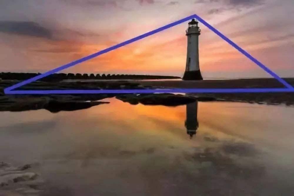
The following picture actually uses a combination of the rule of thirds and a symmetrical composition. In this kind of scene with water surface, a symmetrical composition method can be used to combine the ground and the reflection.
The combination of rule of thirds and symmetrical composition
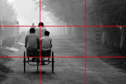
2, rule of thirds
The rule of thirds composition should be the most common and basic composition method. This composition method is to use 4 straight lines to divide the screen into 9 equal squares. This kind of composition is obvious and the picture is concise. At present, most digital cameras and even mobile phones have built-in Jiugongge to assist the composition line, which is suitable for various photographic genres, the most commonly used are scenery, characters, etc.
In the following example picture, the main tree in the picture is placed on the horizontal line of the structure line. This is a very typical rule of thirds composition, which makes the main body of the picture very obvious.
3, structural composition
Select a structured perspective, which can lead the viewer's field of vision to the scenery within the structure, outstanding subjects, and at the same time create a sense of depth. Surrounding the main image to form a structure can create a mysterious atmosphere, just like a person peeping at a place from a hiding place. The structured composition helps to integrate the subject image with the scenery, giving the photo a greater visual impact.
The picture below was taken in Piazza San Marco in Venice. In the picture, the arches frame the church of San Marco and the bell tower. Enclosing the scenery through arches was a common painting method during the Renaissance.

Structural composition
The structure is not necessarily arches and windows. It can also be tree trunks or leaves. The picture below was taken in County Kildare, Ireland. The tree trunks and grass frame the bridge and house in the distance to add depth to the picture.
4. Guide line
Guide line composition method is to use the lines in the picture to guide the viewer's gaze, so that his gaze can finally converge to the focus of the picture. Of course, the guide line is not necessarily a specific line, as long as it is directional and continuous, we can call it a guide line. In real life, roads, rivers, neatly placed trees, colors, shadows, and even human eyes can all be used as guide lines.
Like this photo of the Eiffel Tower, the paving stone is used as a guide line to bring the audience's eyes to the Eiffel Tower. In this picture, a central symmetry composition method is also used.
The guiding line is not necessarily straight. As shown in the figure below, the curved path extends to the direction of the tree, which can also attract the attention of the audience.

5, diagonal and triangle
Diagonal and triangular composition can add dynamic tension to the photo and make the photo look more vivid. Relatively speaking, the horizontal and vertical lines appear to be very stable. If a person stands on a horizontal surface, he looks very stable, but when placed on a slanted surface, it will create a sense of tension. This kind of composition method is more used in construction and sports photography.

6, pictures and lines
Human beings are naturally attracted by pictures. Pictures can be arches, markings on the floor, or reliefs on the walls. These can be used as the visual subject of the picture, and light and shadow can be adjusted to show a special texture.

7, the rule of odd numbers
The law of odd numbers means that when the subject of the picture is an odd number, the picture is more visually appealing. For example, if you want to take a photo of more than one person, don't take 2 people, you should take 3, 5, or 7 people. Of course, this is a stupid idea for taking pictures of wedding dresses. But as long as it is possible, if you are taking more than just commemorative photos of real life, remember the rule of odd numbers.

8, fill the screen
allows the subject to fill the screen, leaving little or no space around it, which helps the audience to pay attention to the subject completely without any interference, and also allows people to see the details of the subject clearly.
As shown in the picture below, in the first picture, the face of the lion fills the entire picture, allowing the audience to clearly observe its eyes and fine hair.

9. Use blank space
mentioned above, to fill the space, but this is the opposite. Leave some blank space in the picture. It also makes your theme obvious and attractive, and at the same time it creates a minimalist picture.

10. Separate the subject from the set
Using shallow depth of field to separate the subject from the set is a good way to distinguish the subject. Through the use of a large aperture, the setting is vague, and the clear subject becomes the focus of the picture at once. This technique is most commonly used in the photography of portraits and life sketches.

11. Change the viewing angle
Many cameras now have a flip screen, and SLR cameras are also equipped with a useful real-time view function, which provides a great convenience for us to take pictures with very regular angles. Don't always create creation at the height of the human eye. Try to lower or increase the field of view. Taking pictures from different angles can achieve unexpected effects.
12. Looking for a specific color combination
For the planner, the combination of colors is very important, but it is simply ignored in the photo. Combining certain colors can be more eye-catching visually. For the color wheel below, the two opposite colors are complementary colors. Arranging these two colors in the same picture can make the picture more attractive.
In the night scene picture below, the blue night sky and the yellow building are combined together. Does it attract your attention all at once?

13. Space guidelines
The space criterion is to leave a lot of space in the direction of the moving objects in the image. For example, the boat in the picture below is traveling to the right, so you can leave a blank on the right side of the screen, so that the image is dynamic. If there is a lot of blank on the left, it gives a feeling that the boat is about to sail out of sight. , May cause problems such as the theme is not outstanding.
In the photo below, the singer playing the guitar faces to the right, so the right side is left blank. We can follow his field of vision to naturally see the scenery on the bridge, the passers-by leaning on the railing, and that Dancing couple.

14. Adhere to the balance of the picture
One mistake often made by beginners in photography is to pay too much attention to the subject and not to pay attention to the setting or contrast with it. In fact, a good photo needs the interaction of the front and back scenes, which gives people the feeling of patchwork. The proper setting of the setting can also make the subject more outstanding. In addition, photos with a distant view and a background view will have a more sense of space.

15, side by side
Side by side is a very powerful method of composition. Side-by-side refers to putting two or more things on the same screen, so that they complement each other, so that both can play an important part of it, and use photos to tell a story. Such a composition method is often used in the humanistic genre.
In the picture below, the scattered newspaper kiosks and the solemn church behind it are side by side, forming a clear contrast, but they represent Paris in different ways, narrate Paris, and tell us two different stories about this city. .

16, golden triangle composition
The golden triangle composition is very similar to the rule of thirds composition, except that the straight line here starts from the 4 corners of the screen, forming two right triangles on the left and right ends. Then the elements of the picture are incorporated into these interspersed places.
The golden triangle rule of this picture is applied delicately. The heads of the two statues form an invisible diagonal line, which leads people to the Eiffel Tower. The line on the left coincides with the diagonal line exactly at the center of gravity of the Eiffel Tower, while the line on the right coincides with the diagonal line at the center of the two sculptures. These two coincidence points are not random points, but the golden ratio points on the diagonal.

Diagonal right angle diagram
17. Golden share
The golden share was originally a mathematical law, discovered by Leonardo Fibonacci around 1200 AD. He noticed that this share appeared in many natural worlds, and the natural structure planning based on this was both practical and beautiful. Although in the field of painting and planning, the golden share is regarded as a criterion, there is not much discussion about it in the photography circle, because it is a high-level composition method, and many people do not understand it. But in fact, the golden share is not complicated. It is very similar to the rule of thirds composition, except that its picture share is not 1:1:1, but 1:0.618:1.

Related Links: